Step 1: From Scratch
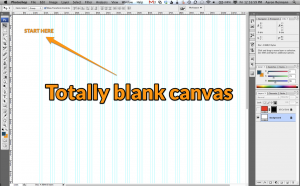
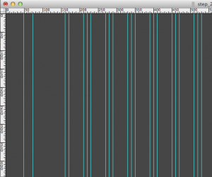
I started off with a blank Photoshop file. Our inspiration is not based on a set layout, a set color scheme or the frames of a content management system. The options are unlimited. |
 |
Step 2: Background
Many times we will use textures and gradients, whatever fits the clients need and identity. For our own web site though, we weren’t trying to push any kind of product or branding. We just wanted our portfolio to shine. Plain grey worked best. |
 |
Step 3: Logo Placement
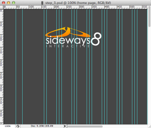
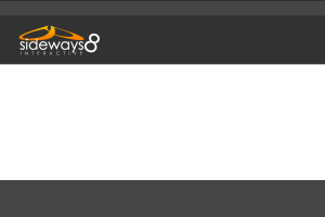
We like our logo, therefore it is on our site. (If your company doesn’t like their logo click on Contact Us.) We aren’t great fans of massive logos so ours is average in the top right. |
 |
Step 4: Beginning the Layout
Sometimes we can spend a lot of time coming up with simple things like the placement of different site elements. Of course, when we were designing a site for ourselves we had a pretty good idea of what we like and don’t have to go through a revision process.
FYI, when we are developing a site for a client we go through a discovery process so we know what the client wants, and in some cases we tell them what they need (kindly of course). |
 |
Step 5: Menu Items
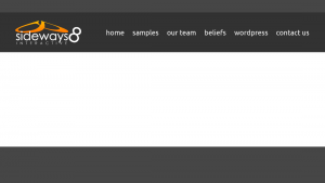
Our site is actually quite simple. Our goal is for people to see our work and contact us. We did not need a “mega-menu” or other complex features to accomplish that goal. Maybe it’s because I’m a little old school but I like the K.I.S.S. mentality and it shows by the end of this process. |
 |
Step 6: Figuring Buttons
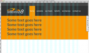
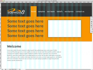
I decided to make the buttons pretty big and flow into the background of the text below. It is alway important for a user to know what page they are on (sometimes it is no necessary on the home page though). I thought it was kind of sweet having the buttons merge with the orange section of the site. |
 |
Step 7: Text and Images
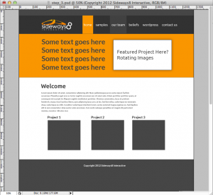
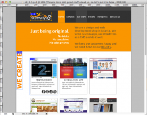
It was time to start highlighting our work and explaining what we do. I was thinking it would be great to have 5 or 6 images where the white box was, kind of a “slideshow” of what we have done. Each image would contain a screenshot of the work and a short description and have them rotating every 5 seconds. Then I put the welcome text below. |
 |
Step 8: Portfolio
I started placing empty boxes with titles that would eventually contain screenshots of recent work. Even though we were going to have the “rotating” images, it still was going to look good to have static images there in case someone missed all of the slides at the top. |
 |
Step 9: Screenshots
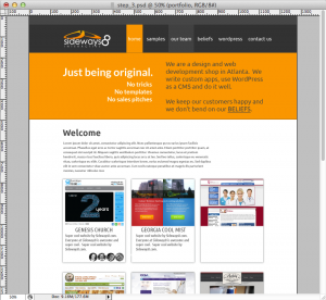
I kept the portfolio concept but made it a little fancier than I originally thought. I came up with the “Just being original. No Tricks, No Templates, No sales pitches” blurb. It just makes sense, that is what we are all about. It’s kind of become a tagline…kind of. I guess it wouldn’t really fit in a logo though. |
 |
Step 10: We Code
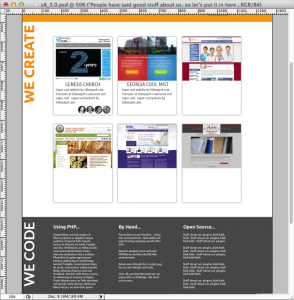
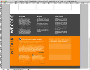
Since our goal was to show our artwork I just decided to lose the welcome text. Our portfolio was much more important than any text we could come up with, even if my business parter (Adam) were to write it.
I bumped up the portfolio and added a “We Code” section below. The “We Code” section just shows some of the tools we use. (Also, these posts are 100% swappable in the admin section…actually, almost everything is editable by the admin). I wanted to show some of our personality (hopefully it doesn’t scare anyone away). |
 |
Step 11: Blogging
Below the “We Code” we wanted people to have access to one of our favorite blog post (the big one on the left, aka “sticky post”) and the below are the two most recent posts. When I’m finished with the article, it will show up as the most recent automatically.
To the right of the blog posts I wanted to show some some of our wonderful client’s quotes also (where are theme options). |
 |
Step 12: Slice’n’Dice
Well, at this point I thought the site was ready to go. Every part of the home page and subpages (even though I’m not showing that here) was designed. Now that I was happy with the design, I ready to “convert” the design in the Photoshop file to a file that the browser can use (.png files is what we use mostly). |
 |
Step 13: Artwork Ready
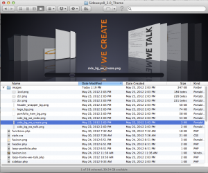
All of our artwork was now ready to use in a web page using CSS/HTML. We create all of the elements and them “export” them out of Photoshop. |
 |
Step 14: Our Framework
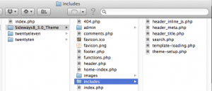
We take our framework (this framework we have developed over the past 3 years) from our repository (“Git” repository to be specific) and place all of our images in the “images” directory”. |
 |
Step 15: Beginning the Coding
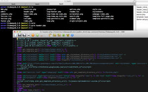
Here is the fun part, or for some, the boring part. I’m more of a coder so this is fun for me. This is where I take our framework and customize it for the layout I designed.
Sidenote: Adam, David and I can all code out a site, but I just happen to code this out. |
 |
Step 16: Custom Programming
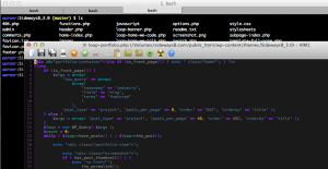
Every project is different and requires unique coding. In this site we have a portfolio section. On the home page we call in 9 of the portfolio items in the “Featured” category, on the portfolio page we call in all of them. The image on the right shows how we call in the WordPress functions that queries the database for the data. Then we loop through and display text and images. |
 |
Step 17: Theme Activation
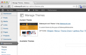
Now we go to an activate the WordPress theme that we just coded out. |
 |
Step 18: Theme Options
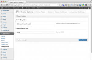
Now that the theme is active I can go in and fill in all of the cool custom fields that I created. Stuff like this makes it easy for even us, the designers, to make changes. |
 |
Step 19: Ready to Show
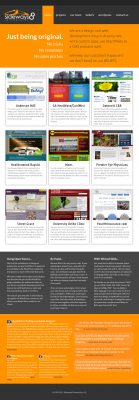
This is a full screen shot of the whole home page. Almost everything in the home page is easy to swap out and change. |
 |
Step 20: Step Back, Look
This is the step when we look back and are happy with our work. |
|


